 williaster
@data-ui/xy-chart
A package that supports making charts with x- and y- cartesian coordinates.


See it live at williaster.github.io/data-ui.
Example usage
The React <XYChart /> container coordinates scales across its children and is composable. You can
pass it <XAxis />, <YAxis />, one or more <*Series /> components, and <defs>-based
components such as <LinearGradients />s and <PatternLines />.
Note that the order of children passed to <XYChart /> determines their rendering order, for
example the a <LineSeries /> passed after a <BarSeries /> will overlay the line on the bars. The
same applies to axes.
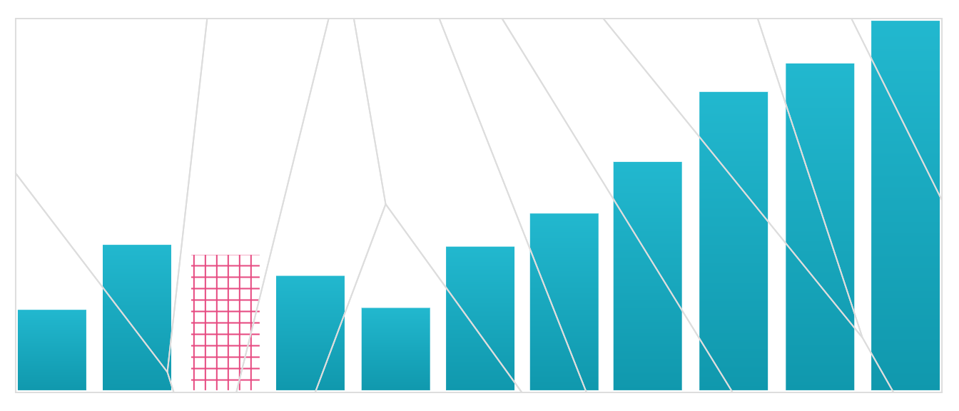
import { XYChart, BarSeries, CrossHair, XAxis, YAxis, LinearGradient } from '@data-ui/xy-chart';

/// ...
<XYChart
  ariaLabel="Bar chart showing ..."
  width={width}
  height={height}
  margin={{ top, right, bottom, left }}
  xScale={{ type: 'time' }}
  yScale={{ type: 'linear' }}
  renderTooltip={({ event, datum, data, color }) => (
    <div>
      <strong style={{ color }}>{datum.label}</strong>
      <div>
        <strong>x </strong>
        {datum.x}
      </div>
      <div>
        <strong>y </strong>
        {datum.y}
      </div>
    </div>
  )}
  snapTooltipToDataX
>
  <LinearGradient id="my_fancy_gradient" from={startColor} to={endColor} />
  <XAxis label="X-axis Label" />
  <YAxis label="Y-axis Label" />
  <BarSeries data={timeSeriesData} fill="url('#my_fancy_gradient')" />
  <CrossHair showHorizontalLine={false} fullHeight stroke="pink" />
</XYChart>;
Components
Check out the example source code and PropTable tabs in the Storybook williaster.github.io/data-ui for more!
<XYChart />
The XYChart renders an <svg /> and coordinates scales across all of its child series and axes.
It takes the following props
| Name | Type | Default | Description |
|---|---|---|---|
| ariaLabel | string.isRequired | - | Required aria-label for accessibility. |
| children | node | - | Any node; axes, crosshair, and series children are cloned with additional props such as scales. |
| eventTrigger | oneOf(['series', 'container', 'voronoi']) | series |
Specifies the triggers for mouse events, see below. |
| eventTriggerRefs | func | - | Callback invoked on mount, which receives an object containing references to the instances event handlers { click, mousemove, mouseleave }, to support programmatic invocation (see below) |
| height | number.isRequired | - | Required height of the chart (including margin). Check out withParentSize in the examples for responsive charts. |
| innerRef | func | - | Callback ref that is set on the inner svg element |
| margin | shape({ top: number, right: number, bottom: number, left: number }) | { top: 64, right: 64, bottom: 64, left: 64 } | chart margin, leave room for axes and labels! a "complete" margin will be created using the default top/right/bottom/left values meaning that you have to explicitly set each dimension for full control. also note that a value of 0 may clip LineSeries and PointSeries. |
| onClick | func | - | func({ datum, event [, coords [, data, [, color [, series [, seriesKey]]]]] }), passed to all child series (or voronoi) |
| onMouseMove | func | - | func({ datum, event [, coords [, data, [, color [, series [, seriesKey]]]]] }), passed to all child series (or voronoi). only needed if you are rolling your own tooltips (see below) |
| onMouseLeave | func | - | func(), passed to all child series (or voronoi). only needed if you are rolling your own tooltips (see below) |
| renderTooltip | func | - | ({ datum, event [, coords [, data, [, color [, series [, seriesKey]]]]] }) => node, should return the inner tooltip contents on trigger. |
| showXGrid | bool | false | whether to show vertical gridlines |
| showYGrid | bool | false | whether to show vertical gridlines |
| xGridValues | array | - | Array of values for vertical gridlines. Overrides XAxis.props.tickValues if specified |
| xGridOffset | number | barWidth / 2 (band scale) or 0 | Offset of vertical grid lines from value |
| yGridValues | array | - | Array of values for horizontal gridlines. Overrides YAxis.props.tickValues if specified |
| yGridOffset | number | barWidth / 2 (band scale) or 0 | Offset of vertical grid lines from value |
| showVoronoi | bool | false | convenience prop for debugging to view the underlying voronoi if eventTrigger='voronoi' |
| snapTooltipToDataX | bool | false | whether to pass coords.x in event callbacks, which has the effect of snapping a tooltip to data x values |
| snapTooltipToDataY | bool | false | whether to pass coords.y in event callbacks, which has the effect of snapping a tooltip to data y values |
| theme | themeShape | false | theme shape, see below |
| width | number.isRequired | - | Required width of the chart (including margin). Check out withParentSize in the examples for responsive charts. |
| xScale | scaleShape.isRequired | - | scale config, see below. |
| yScale | scaleShape.isRequired | - | scale config, see below. |
Scale config
X and y-scales are configured using xScale and yScale config props which essentially configure
d3/vx scales:
const scaleConfigShape = PropTypes.shape({
  type: PropTypes.oneOf(['time', 'timeUtc', 'linear', 'band', 'ordinal']).isRequired,
  includeZero: PropTypes.bool,

  // these would override any computation done by XYChart, allowing specific ranges or colors
  // see storybook for more examples
  range: PropTypes.arrayOf(PropTypes.oneOfType([PropTypes.number, PropTypes.string])),
  rangeRound: PropTypes.arrayOf(PropTypes.oneOfType([PropTypes.number, PropTypes.string])),
  domain: PropTypes.arrayOf(PropTypes.oneOfType([PropTypes.number, PropTypes.string])),
});
Entries in scale objects are shallow checked so new objects don't trigger re-renders.
<XAxis /> and <YAxis />
| Name | Type | Default | Description |
|---|---|---|---|
| axisStyles | axisStylesShape | {} |
config object for axis and axis label styles, see theme above. |
| label | PropTypes.oneOfType( [PropTypes.string, PropTypes.element] ) | <Text {...axisStyles.label[ orientation ]} /> |
string or component for axis labels |
| numTicks | PropTypes.number | null | approximate number of ticks (actual number depends on the data and d3's algorithm) |
| orientation | PropTypes.oneOf(['top', 'right', 'bottom', 'left']) | bottom (XAxis), right (YAxis) | orientation of axis |
| tickStyles | tickStylesShape | {} |
config object for styling ticks and tick labels, see theme above. |
| tickLabelComponent | PropTypes.element | <Text {...tickStyles.label[ orientation ]} /> |
component to use for tick labels |
| tickFormat | PropTypes.func | null | (tick, tickIndex) => formatted tick |
| tickValues | PropTypes.arrayOf( PropTypes.oneOfType([ PropTypes.number, PropTypes.string ]) ) | null | custom tick values |
Series
Several types of series types are exported by the package, and can be used in combination. See the storybook source for more proptables for your series of interest. Here is an overview of scale support and data shapes:
| Series | supported x scale type | supported y scale types | data shape | supported eventTriggers |
shared tooltip compatible | supports onFocus + onBlur |
|---|---|---|---|---|---|---|
<AreaSeries /> |
time, linear |
linear |
{ x, y [, y0, y1, fill, stroke] }* |
series, container, voronoi* |
yes | yes |
<BarSeries /> |
time, linear, band |
linear |
{ x, y [, fill, stroke] } |
series, container |
yes | yes |
<LineSeries /> |
time, linear |
linear |
{ x, y [, stroke] } |
series, container, voronoi |
yes | yes |
<PointSeries /> |
time, linear |
time, linear |
{ x, y [size, fill, stroke, label] } |
series, container (not best for dense data) voronoi |
yes | yes (pointComponent must implement) |
<StackedAreaSeries /> |
time, linear |
linear |
{ x, y [, [stackKey(s)]] }* |
series |
data for all stack keys should be in passed datum |
no |
<StackedBarSeries /> |
band |
linear |
{ x, y } (colors controlled with stackFills & stackKeys) |
series |
data for all stack keys should be in passed datum |
no |
<GroupedBarSeries /> |
band |
linear |
{ x, y } (colors controlled with groupFills & groupKeys) |
series |
data for all group keys should be in passed datum |
no |
<CirclePackSeries /> |
time, linear |
y is computed | { x [, size] } |
series |
no | yes (pointComponent must implement) |
<IntervalSeries /> |
time, linear |
linear |
{ x0, x1 [, fill, stroke] } |
series |
no | yes |
<BoxPlotSeries /> |
linear, band |
band, linear |
{ x (or y), min, max, median, firstQuartile, thirdQuartile, outliers [, fill, stroke] } |
series |
no | yes |
<ViolinPlotSeries /> |
linear, band |
band, linear |
{ x (or y), binData [, fill, stroke] } |
series |
no | yes |
<AreaDifferenceSeries /> |
time, linear |
linear |
data passed to children | all supported by AreaSeries |
yes | yes |
* The y boundaries of the <AreaSeries/> may be specified by either
- defined
y0andy1values or - a single
yvalue, in which case its lower bound is set to 0 (a "closed" area series)
Series labels
The <PointSeries /> and <BarSeries /> components support rendering labels per-datum via the
renderLabel and defaultLabelProps props.
- by default, if a datum has a label property, it will have a label rendered out of the box using
the
@vx/text<Text />component (which wraps svg text, etc.). labels are always rendered on top of theBars andPoints themeselves. - The label has "smart" default aesthetics (taking from the
@data-uitheme), text anchors, and wrapping behavior, but you can override them by settingdefaultLabelPropsto your own object. By default these props are passed to the underlying<Text />label component, andd.labelis rendered as the child - to support full label customization, you may define a
renderLabelfunction with the signature({ datum, index, labelProps }) => node. labelProps includes all values fromdefaultLabelPropsas well as "smart" default values forwidth,x,y,dx,dy,verticalAnchor, andtextAnchorbased onBarandPointposition, size, and orientation (horizontal vs vertical). - Example usage:
<BarSeries
  {...restProps}
  renderLabel={({ datum, labelProps, index: i }) =>
    datum.label ? (
      <Text {...labelProps} fill={datum.selected ? COLOR_2 : COLOR_1}>
        {datum.label}
      </Text>
    ) : null
  }
/>
<CirclePackSeries />

This series implements the Circle packing algorithm described by
Wang
et al. Visualization of large hierarchical data by circle packing, but attempts to preserve
datum x values (although they may be modified slightly). It is useful for visualizing e.g., atomic
events where x values may partially overlap, and provides an alternative to an atomic histogram
without a requirement for binning x values. Alternatively, users can pass their own layout algorithm
as the value of prop layout (one example is included in the demo package.)
Note that only x values are needed for CirclePackSeries, y values are computed based on x
and size (if specified). Similar to PointSeries, size, fill, and fillOpacity may be set on
datum themseleves or passed as props to the CirclePackSeries component.
<AreaDifferenceSeries />
This series has a different API from other series in that it wraps two AreaSeries (see the
storybook example for more details):
<AreaDifferenceSeries>
  <AreaSeries data={data1} {...moreAreaSeriesProps} />
  <AreaSeries data={data2} {...moreAreaSeriesProps} />
</AreaDifferenceSeries>
The result will show the difference between the two AreaSeries, with a fill that matches the
AreaSeries with the greater y-value.
Reference Lines
<HorizontalReferenceLine /> and <VerticalReferenceLine /> are available for chart annotations
with the following usage pattern:
<XYChart ...>
  <LineSeries data={[ { x: new Date('2018-01-01'), y: 10 }, ... ]} />
  {/* Wraps text within width of 100px */}
  <HorizontalReferenceLine
    reference={25}
    stroke="magenta"
    label="My y-threshold"
    labelProps={{ width: 100, verticalAnchor: 'middle' }}
  />
  <VerticalReferenceLine
    reference={new Date('2018-01-05')}
    label="My birthday"
    labelProps={{ width: 100, textAnchor: 'start', dx: '0.5em' }}
  />
</XYChart>
The both take the following props
| Name | Type | Default | Description |
|---|---|---|---|
| label | PropTypes.string | null | Optional label to render along with the line. The string is wrapped in a @vx/text Text component which you can customize using the labelProps prop |
| labelProps | PropTypes.object | @data-ui/theme baseLabel props with text anchors + dx/dy that offset label from line | Props that are passed to @vx/text Text component. See here for full list. |
| stroke | PropTypes.string | @data-ui/theme darkGray | Stroke color of line |
| stroke | PropTypes.string | @data-ui/theme darkGray | Stroke color of line |
| strokeDasharray | PropTypes.string | null | stroke-dash-array style of line |
| strokeLinecap | PropTypes.oneOf(['butt', 'square', 'round', 'inherit']) | 'round' | stroke-linecap style of line |
| strokeWidth | PropTypes.number | 1 | stroke-width style of line |
Tooltips, Mouse Events, and Triggers
Tooltips
Tooltips are supported for all series types, but how you trigger and configure them triggers you
want, will likely depend on which series combinations you're using and how much customization you
need. The easiest way to use tooltips out of the box is by passing a renderTooltip function to
<XYChart /> as shown in the above example. This function takes an object with the shape
{ datum, event [, coords [, data, [, color [, series [, seriesKey]]]]] } (see function signatures
section below for more) as input and should return the inner contents of the tooltip (not the
tooltip container!) as shown above. You may snap tooltips to data x and y values by setting
snapTooltipToDataX and/or snapTooltipToDataY to true on XYChart.
Under the covers this will wrap the <XYChart /> component in the exported <WithTooltip /> HOC,
which wraps the <svg /> in a <div /> and handles the positioning and rendering of an HTML-based
tooltip with the contents returned by renderTooltip(). This tooltip is aware of the bounds of its
container and should position itself "smartly".
If you'd like more customizability over tooltip rendering you can do either of the following:
Roll your own tooltip positioning logic and pass
onMouseMoveandonMouseLeavefunctions toXYChart. These functions are triggered according to theeventTriggerprop and are called with the signature described below upon appropriate trigger. Note that you must also passtooltipDatatoXYChartif you are using theCrossHaircomponent, which has an expected shape of{ datum [, series] }containing the datum(s) to emphasize.Wrap
<XYChart />with<WithTooltip />yourself, which accepts props for additional customization:
| Name | Type | Default | Description |
|---|---|---|---|
| children | PropTypes.func or PropTypes.object | - | Child function (to call) or element (to clone) with onMouseMove, onMouseLeave, and tooltipData props |
| className | PropTypes.string | - | Class name to add to the <div> container wrapper |
| renderTooltip | PropTypes.func.isRequired | - | Renders the contents of the tooltip, signature of ({ event, data, datum, color }) => node. If this function returns a falsy value, a tooltip will not be rendered. |
| styles | PropTypes.object | {} | Styles to add to the <div> container wrapper |
| TooltipComponent | PropTypes.func or PropTypes.object | @vx's TooltipWithBounds |
Component (not instance) to use as the tooltip container component. It is passed top and left numbers for positioning |
| tooltipProps | PropTypes.object | - | Props that are passed to TooltipComponent |
| tooltipTimeout | PropTypes.number | 200 | Timeout in ms for the tooltip to hide upon calling onMouseLeave |
Note that to correctly position a tooltip, the <WithTooltip /> onMouseMove function minimally
requires an event or coords object of the form { x: Number, y: Number }. If coords is
specified it takes precedent over any position computed from the event. See function signatures
below for more.
Accessibility
Note that unless disableMouseEvents=true, most series currently invoke onMouseMove and
onMouseLeave when focused and blured, respectively, so that tooltips are accessible for
keyboard-only users. Support for these events is reflected in the SeriesComponent table above.
<CrossHair />
The <CrossHair /> component may be used in combination with tooltips for additional visual
feedback (see the storybook for many examples!). Simply pass the component as a child of
<XYChart /> and it will automatically position itself upon tooltip trigger. Compared to a tooltip,
this component snaps to actual data points for improved precision. It accepts the following props:
| Name | Type | Default | Description |
|---|---|---|---|
| fullHeight | PropTypes.bool | false | whether the vertical line should span the entire height of the chart |
| fullWidth | PropTypes.bool | false | whether the horizontal line should span the entire width of the chart |
| circleSize | PropTypes.number or func(d,i) => PropTypes.number | 4 | the radius of the circle |
| circleFill | PropTypes.string or func(d,i) => PropTypes.string | data-ui/theme.colors.grays[7] | the fill of the circle |
| circleStroke | PropTypes.string or func(d,i) => PropTypes.string | white | the stroke of the circle |
| circleStyles | PropTypes.object or func(d,i) => PropTypes.object | { pointerEvents: 'none' } | styles passed to the circle |
| lineStyles | PropTypes.object | { pointerEvents: 'none' } | styles passed to both horizontal and vertical lines |
| showCircle | PropTypes.bool | true | whether to show the circle |
| showMultipleCircles | PropTypes.bool | false | whether to show multiple circles when tooltipData includes a series key (when XYChart's eventTrigger="container") |
| showHorizontalLine | PropTypes.bool | true | whether to show the horizontal crosshair line |
| showVerticalLine | PropTypes.bool | true | whether to show the vertical crosshair line |
| stroke | PropTypes.oneOfType([PropTypes.func, PropTypes.string]) | data-ui/theme.colors.grays[6] | the stroke of both horizontal and vertical lines |
| strokeDasharray | PropTypes.oneOfType([PropTypes.func, PropTypes.string]) | 5,2 |
The stroke-dash-array of both horizontal and vertical lines |
| strokeWidth | PropTypes.oneOfType([PropTypes.func, PropTypes.number]) | 1 | The strokeWidth of both horizontal and vertical lines |
Mouse Events & Triggers
XYChart has hooks for mousemove, mouseleave, and click events that can be triggered at
different levels as specified by the eventTrigger prop:
eventTrigger='series'
For the series event trigger, XYChart will pass along event handlers to its child series unless
a series has disableMouseEvents set to true, and any event handlers defined at the series level
will override those defined at the XYChart level. Series-level events are triggered by
interactions with the series DOM elements themselves.
eventTrigger='container'
For the container event trigger, the XYChart container will intercept all mouse events and event
handlers will be called with all datums nearest the hovered x value. This type of event trigger is
useful if you want to implement a shared tooltip. Note that data passed to series should be sorted
by x-value for this to work correctly.
eventTrigger='voronoi'

For series components that have "small" mouse areas, such as PointSeries and LineSeries, you may
opt to use an invisible
Voronoi
overlay on top of the visualization to increase the target area of interaction sites and improve
user experience. To view or debug a voronoi you may set the convenience prop showVoronoi to
true. Note that this will compute a voronoi layout for all data points across all series.
Note ‼️
It is worth noting that voronoi overlays require a defined y attribute, so use of voronoi with
only y0 and y1 values will not work (this is reflected in the compatibility table above).
Additionally, because of the polygonal shapes generated by the voronoi layout, you probably don't
want to use this option if you are e.g., only rendering a BarSeries because the bar points
represent the tops of the bars and thus polygons for one bar may overlap the rect of another bar
(again, you may use showVoronoi to debug this).
Functions and Function Signatures
XYChart and all series support onMouseMove, onMouseLeave, and onClick event handlers with
the following signatures:
onMouseMove({ datum, event [, coords [, data, [, color [, series [, seriesKey]]]]] })
onClick({ datum, event [, coords [, data, [, color [, series [, seriesKey]]]]] })
onMouseLeave()
A seriesKey is passed when eventTrigger=series for <StackedAreaSeries />,
<StackedBarSeries />, or <GroupedBarSeries />. It corresponds to the relevant stackKey or
groupKey that triggered the event.
series is passed when eventTrigger=container and represents an object of datums across all
series components nearest the current mouse x. The closest datum across all series components
is passed as datum in the function signature. Within the series object, datums are keyed on
the seriesKey prop set on the series component itself. similar to React, if seriesKey is not
set its index as a child of XYChart will be used which is more error prone
coords is an object of the form { x: Number, y: Number }. XYChart passes x and y only if
snapTooltipToDataX or snapTooltipToDataY are true, respectively.
Programmatically triggering tooltips
XYChart exposes hooks to manually trigger any of these handlers with the eventTriggerRefs prop.
Similar to React refs, this prop is a callback function that is called by XYChart after
mounting. The callback receives an object as input, with keys corresponding to the event type names
and respective handlers as values: eventTriggerRefs({ click, mousemove, mouseleave }). The ref
handlers have the same signatures as defined above.
Note that snapTooltipToData* props will still have an effect when events are triggered this way.
Theme
A theme object with the following shape can be passed to <XYChart /> to style the chart, axes, and
series. See
@data-ui/theme
for an example.
export const themeShape = PropTypes.shape({
  gridStyles: PropTypes.shape({
    stroke: PropTypes.string,
    strokeWidth: PropTypes.number,
  }),
  xAxisStyles: PropTypes.shape({
    stroke: PropTypes.string,
    strokeWidth: PropTypes.number,
    label: PropTypes.shape({
      bottom: PropTypes.object,
      top: PropTypes.object,
    }),
  }),
  yAxisStyles: PropTypes.shape({
    stroke: PropTypes.string,
    strokeWidth: PropTypes.number,
    label: PropTypes.shape({
      left: PropTypes.object,
      right: PropTypes.object,
    }),
  })
  xTickStyles: PropTypes.shape({
    stroke: PropTypes.string,
    tickLength: PropTypes.number,
    label: PropTypes.shape({
      bottom: PropTypes.object,
      top: PropTypes.object,
    }),
  }),
  yTickStyles: PropTypes.shape({
    stroke: PropTypes.string,
    tickLength: PropTypes.number,
    label: PropTypes.shape({
      left: PropTypes.object,
      right: PropTypes.object,
    }),
  }),
});
More on the way.
Other
These vx gradients and
patterns are exported in @data-ui/xy-chart to customize the style of series. These components
create <defs> elements in the chart SVG with ids that you can reference in another component.
See the storybook for example usage!
Development
npm install
yarn run dev # or 'build'