 GeekyAnts
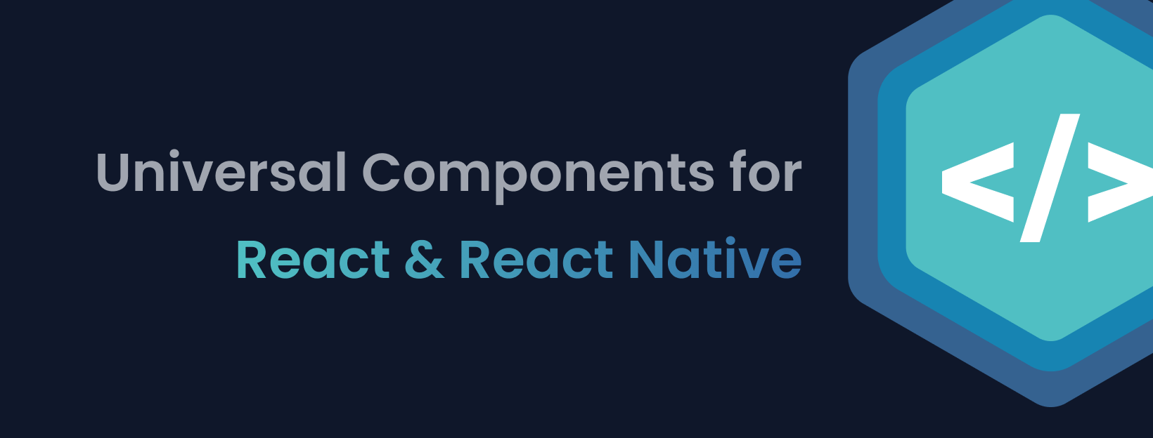


NativeBase is a mobile-first, accessible component library for building a consistent design system across android, iOS & web.
Table of Contents
- Introduction
- Motivation
- Features
- Dependencies
- Installation & Setup
- Components
- Examples
- KitchenSink App
- Tech Stack
- Compatible Versions
- Contributors
- Changelog
- Community
- License
1. Introduction?
NativeBase is a mobile-first, component library for React & React Native. Version 3.0 ships with complete ARIA integration, support for utility props and nearly 40 components that are consistent across Android, iOS and Web. Fast-track your dev process with NativeBase 3.0.
Recommended by Awesome React Native
NativeBase was added to the list of Frameworks of Awesome React Native and it is used by numerous React lovers across the world.
2. Motivation
Building with React Native from scratch is a tedious process with multiple steps such as adding styling, interactions, state management, responsiveness, accessibility, etc. We wanted to build and ship accessible, high-quality apps quickly.
Our inspirations include Material UI, Chakra UI, Ant Design, Braid Design System, Bootstrap, TailwindCSS & Flutter.
3. Features
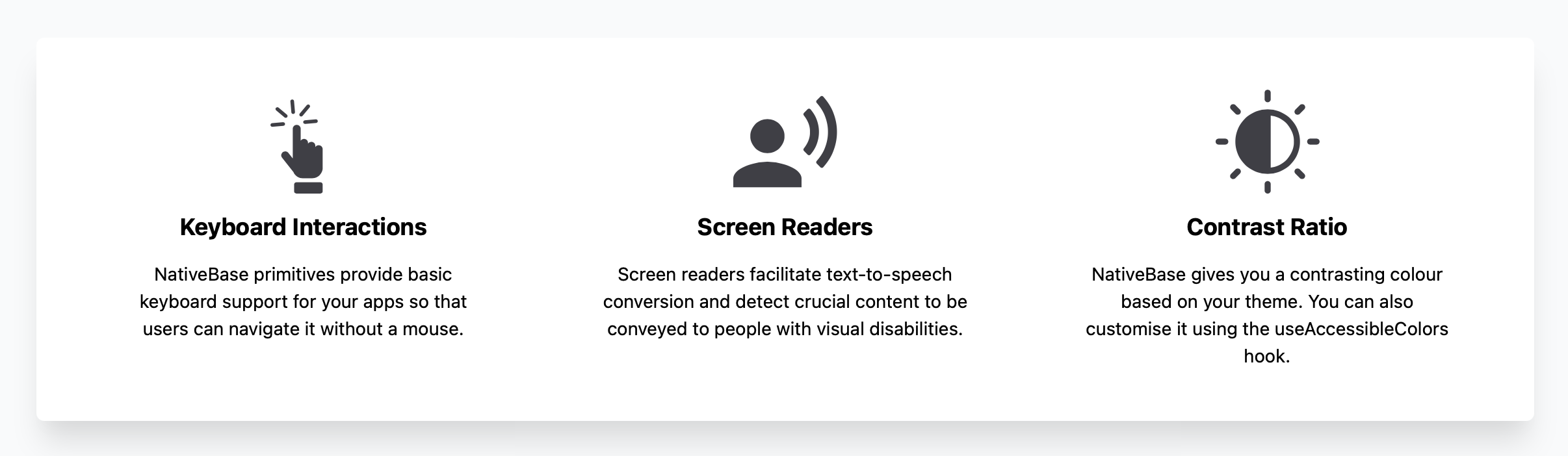
Out of the Box Accessibility
Integrated with React ARIA and React Native ARIA, which provides React hooks. This enables you to build accessible design systems in no time.
Supporting Utility Props
Powered by Styled System so you can rapidly build custom UI components with constraint-based utility style props.
Rich Component Library
NativeBase offers around 40 components so you can build seamlessly. It includes button, checkbox, flex, stack and more.
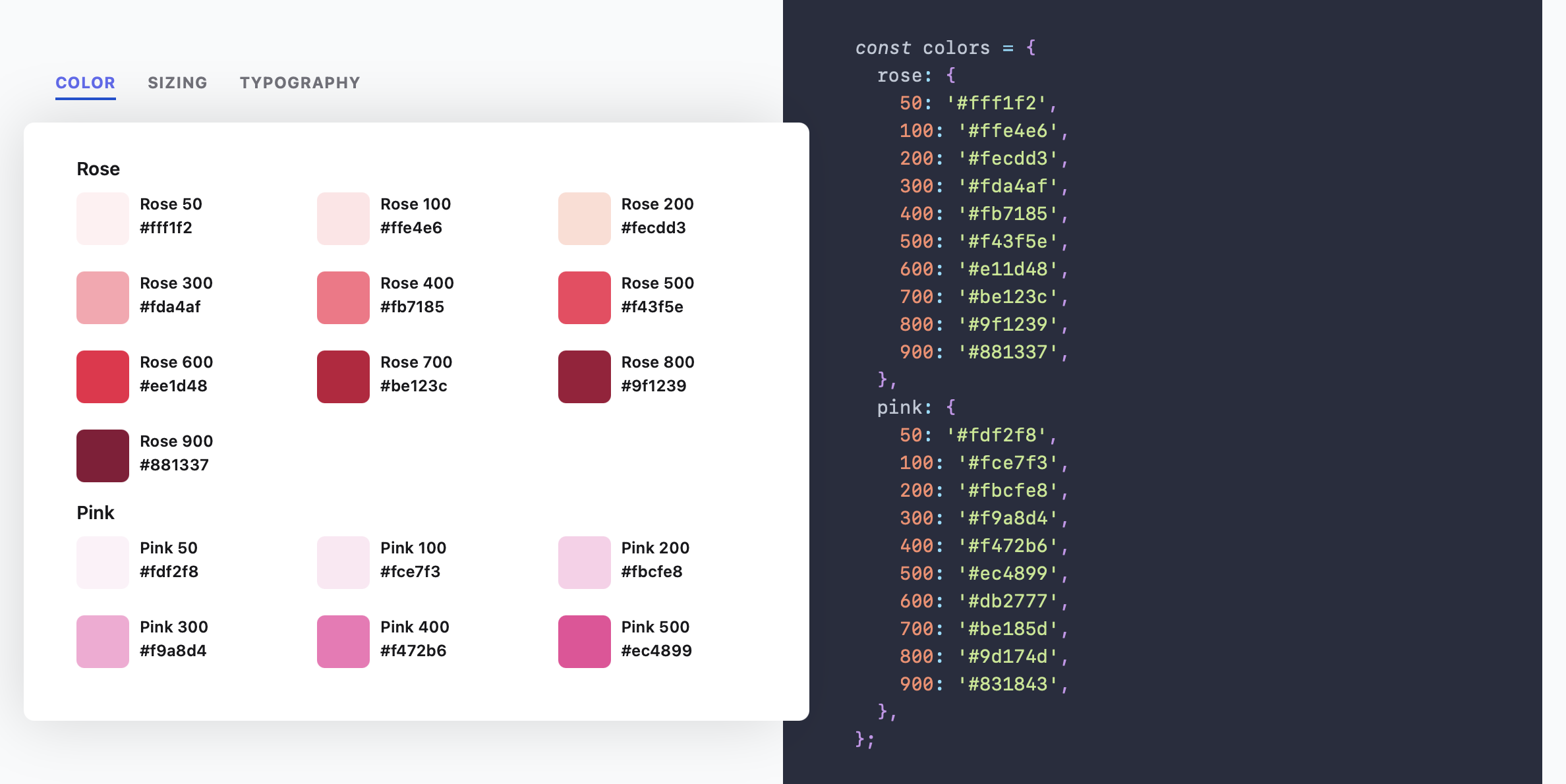
Highly Themeable
Themeability is one of the core elements of NativeBase. You can customise your app theme and component styles to your heart's content.
Available for Both Mobile and Web
NativeBase 3.0 is powered by React Native Web so you can build consistent UIs across Web, Android and iOS.
Responsiveness Made Easy
Instead of manually adding responsiveness, NativeBase 3.0 allows you to provide object and array values to add responsive styles.
Now with Dark Mode
Building apps with a dark mode setting just got a whole lot easier. NativeBase is now optimised for light and dark modes.
4. Dependencies
React Native, Expo
5. Installation
NativeBase is supported in Expo or React Native CLI initiated apps. Web support is made possible by react-native-web.
Refer the guides to setup NativeBase in your React app.
6. Components
NativeBase 3.0 is a rich component library with nearly 40 components.
7. Examples
Check out the Todo-List example
8. KitchenSink App
Kitchen Sink is a comprehensive demo app showcasing all the NativeBase components in action. It includes buttons, forms, icons, etc.


9. Tech Stack
JavaScript, React Native, Styled System
Made with :heart: at GeekyAnts
NativeBase is an open-source project made by the tech-savvy geeks at GeekyAnts. GeekyAnts is a group of React Native experts. Do get in touch with us for any help with your React Native project. Always happy to help!
10. Compatible Versions
| NativeBase | React Native |
|---|---|
| v0.1.1 | v0.22 to v0.23 |
| v0.2.0 to v0.3.1 | v0.24 to v0.25 |
| v0.4.6 to v0.4.9 | v0.26.0 - v0.27.1 |
| v0.5.0 to v0.5.15 | v0.26.0 - v0.37.0 |
| v0.5.16 to v0.5.20 | v0.38.0 - v0.39.0 |
| v2.0.0-alpha1 to v2.1.3 | v0.38.0 to v0.43.0 |
| v2.1.4 to v2.1.5 | v0.44.0 to v0.45.0 |
| v2.2.0 | v0.44.0 to v0.45.0 |
| v2.2.1 | v0.46.0 and above |
| v2.3.0 to 2.6.1 | v0.46.0 and above (does not support React 16.0.0-alpha.13) |
| v2.7.0 | v0.56.0 and above |
| v3.0.0-next.36 to v3.0.0-next-41 | v0.63.0 and above |
| v3.0.0 to latest | v0.63.0 and above |
11. Contributors
Code Contributors
This project exists thanks to all the people who contribute. [Contribute].

Financial Contributors
Become a financial contributor and help us sustain our community. [Contribute]
Individuals

Organizations
Support this project with your organization. Your logo will show up here with a link to your website. [Contribute]
12. Changelog
Check out the changelog in the official documentation
13. Community
14. License
Licensed under the MIT License, Copyright © 2021 GeekyAnts. See LICENSE for more information.